Short-Answer Items
Use the graphs below to answer questions 1 through 8.
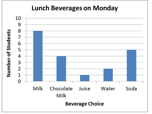
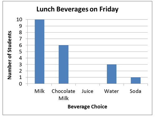
- How many fewer students chose water on Monday than on Friday?
- 1
- 2
- 3
- 4
- Which two beverages were chosen by more students on Friday than on Monday?
- milk and chocolate milk
- juice and water
- chocolate milk and soda
- juice and soda
- How many fewer students drank water than chocolate milk on Monday?
- 1
- 2
- 3
- 4
- Which list shows the number of beverages chosen on Friday, ordered from greatest to least?
- milk, chocolate milk, water, soda, juice
- chocolate milk, juice, milk, soda, water
- soda, milk, water, chocolate milk, juice
- milk, soda, chocolate milk, water, juice
- Which statement is true?
- The total of chocolate milk chosen on Monday was less than the total of soda chosen on Friday.
- The total of chocolate milk chosen on Monday and was more than the total of milk chosen on Friday.
- The total of chocolate milk chosen on Monday was equal to the total of water and soda chosen on Friday.
- The total of chocolate milk chosen on Monday was the same as the total of juice chosen on Friday.
- What are the labels on the graphs?
- Lunch Beverages on Monday, Lunch Beverages on Friday
- Number of Students, Beverage Choices
- Milk, Chocolate Milk, Juice, Water, Soda
- 1, 2, 3, 4, 5, 6, 7, 8, 9, 10, 11, 12
- Which beverage changed the most from Monday to Friday?
- milk
- chocolate milk
- juice
- soda
- How many students took part in the survey?
- 4
- 5
- 12
- 20
- Match each table to its graph.
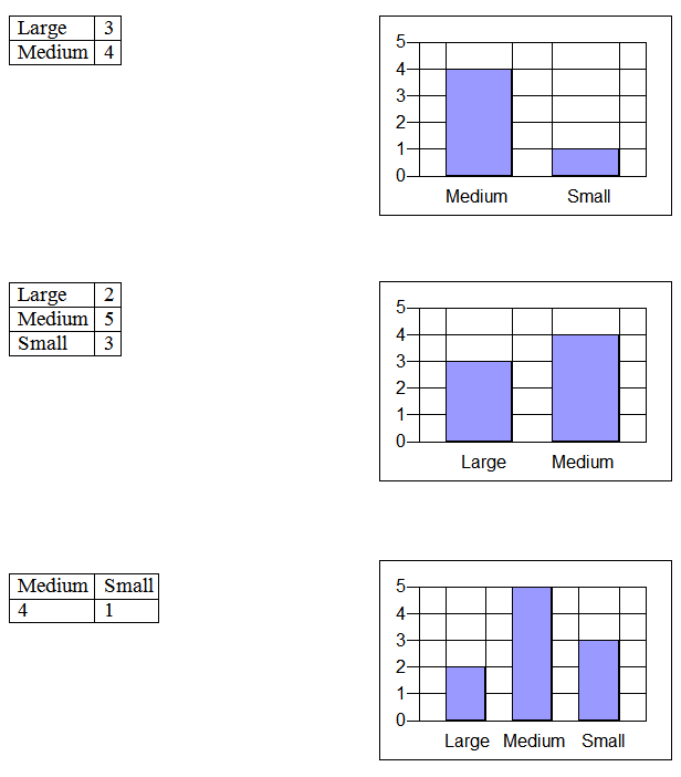
10. Use the information in the tally chart to draw a bar graph.

11. Ronald’s class has the books shown below.

- Organize the books into categories. Use words or pictures.
- Explain how you organized the data.
12. This graph shows the number of books Rachel and Jose read last summer.
Summer Reading
|
Rachel
|

|
|
Jose
|

|
 = 5 books
Use the information in the picture graph to make a tally chart.
Summer Reading
Short-Answer Key:
- A
- A
- B
- A
- C
- B
- D
- D
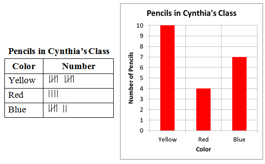
9. Match each table to its graph.
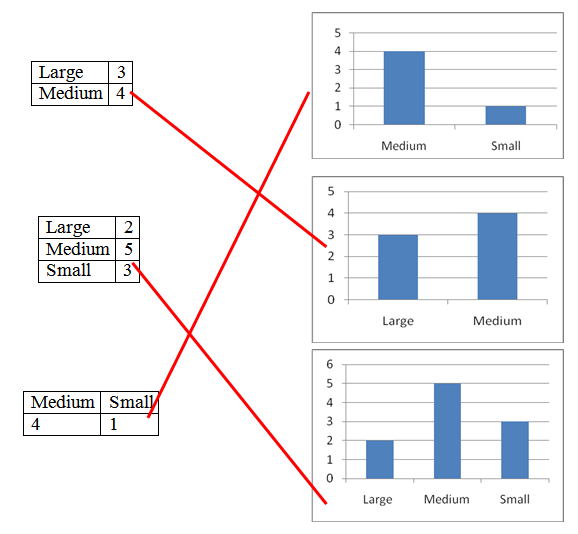
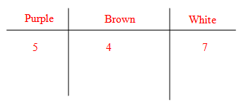
10. Use the information in the tally chart to draw a bar graph.
11. Ronald’s class has the books shown below.

- Organize the books into categories. Use words or pictures.
Students may use any method to divide books by colors.
- Explain how you organized the data.
I put them in groups by color.
Answers will vary.
12. This graph shows the number of books Rachel and Jose read last summer.
Summer Reading
|
Rachel
|

|
|
Jose
|

|
 = 5 books
Use the information in the picture graph to make a tally chart.
Summer Reading
|
Rachel
|

|
|
Jose
|

|
Performance Assessment:
Juan took a survey of his friends. He asked how many times they had been to summer camp. The bar graph below shows Juan’s results.

- Make a line plot with data from the bar graph.
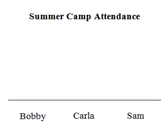
- Juan has been to summer camp 3 times. Add Juan’s data to the bar graph below.
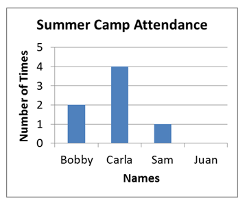
- Has Carla has been to summer camp twice as often as Bobby? Yes or no. Explain your answer.
_______________________________________________________.
- How many more times has Juan been to summer camp than Bobby?____
- Who has been to summer camp the least number of times? ___________
- How many times have Juan and Sam been to summer camp altogether?_________
- Which two people have been to summer camp the most times?
__________________ _________________
- Is “Number of Times” a title for the graph or a label?
________________
Performance Assessment Scoring Rubric:
Juan took a survey of his friends. He asked how many times they had been to summer camp. The bar graph below shows Juan’s results.

- Make a line plot with data from the bar graph.
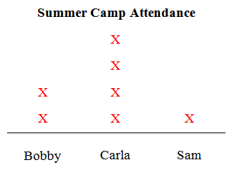
- Juan has been to summer camp 3 times. Add Juan’s data to the bar graph below.

- Has Carla has been to summer camp twice as often as Bobby? Yes or no. Explain your answer. Yes, Carla has been 4 times and Bobby has been 2 times. 4 is twice as much as 2.
- How many more times has Juan been to summer camp than Bobby? 1
- Who has been to summer camp the least number of times? Sam
- How many times have Juan and Sam been to summer camp altogether? 4
- Which two people have been to summer camp the most times? Carla and Juan
- Is “Number of Times” a title for the graph or a label? a label
Points
|
Description
|
|
4
|
- Mathematical responses are all correct.
- Visual representations are correctly and clearly displayed.
- Student demonstrates thorough understanding of data display concepts.
- Student performs beyond problem requirements.
|
|
3
|
- Mathematical responses are correct, possibly with one minor error.
- Visual representations are correct but not completely clear or only partially explained.
- Student demonstrates good understanding of data display concepts.
- Student meets all problem requirements.
|
|
2
|
- Mathematical responses have one major or two minor errors.
- Visual representations are provided but have some errors in logic or lack of detail.
- Student demonstrates fair understanding of data display concepts with slight errors.
- Student meets most problem requirements.
|
|
1
|
- Mathematical responses have major errors or three or more minor errors.
- Visual representations are shown but are illogical, lacking clarity or very little is shown.
- Student demonstrates limited understanding of data display concepts.
- Student does not meet most problem requirements.
|
|
0
|
- Mathematical responses are all incorrect or missing.
- Visual representations are completely incorrect or missing.
- Student demonstrates no understanding of data display concepts.
- Student does not meet problem requirements.
|
